Loading...
Searching...
No Matches
UI widgets
Deki 2D comes with the widgets a device screen needs: buttons, sliders, switches, lists, pickers, a text box with an on-screen keyboard, charts. They draw with shapes and text, so they look the same on every device and in every colour format, and each one is a component you add to an object.
The widgets
| Widget | What it is | Its events |
|---|---|---|
| Button | Makes an object a button: hover, press and click. | AddOnClickCallback, AddOnPressCallback, AddOnReleaseCallback |
| Bar | A value between a minimum and a maximum: health, loading, volume. | SetValue |
| Slider | A bar with a knob to drag, or to step with the arrow keys. | AddOnValueChangedCallback, AddOnValueCommittedCallback |
| Switch | On and off, with a sliding knob. | AddOnToggledCallback |
| Checkbox | A box that ticks on and off, with a label. | AddOnToggledCallback |
| LED | A round light with a colour, a brightness and a glow. | SetOn, SetBrightness |
| Arc | A round gauge or dial. | AddOnValueChangedCallback |
| Spinner | A busy indicator. | |
| Spinbox | A number with minus and plus buttons. | AddOnValueChangedCallback |
| Dropdown | A field that opens a list to pick one option. | AddOnSelectionChangedCallback |
| List | A scrolling column of rows to tap, with section titles. | AddOnItemClickedCallback |
| Roller | A wheel of values that spins and snaps. | SetOnSelectionChanged |
| Tab View | Tabs over pages, one page at a time. | AddOnTabChangedCallback |
| Message Box | A dialog with a title, a message and buttons. | Open, AddOnClosedCallback |
| Date Picker | Day, month and year rollers. | AddOnDateChangedCallback |
| Text Area | A box to type into. | AddOnTextChangedCallback, AddOnSubmitCallback |
| Keyboard | A keyboard on the screen that types into a text area. | AddOnKeyCallback |
| Chart | A line or bar chart of a series of values. | AddPoint |
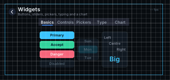
Some of the widgets in the Scene View
The two building blocks under them are useful on their own: Shape draws a rounded rectangle, ellipse, arc, triangle or tick with smooth edges, and Scroll scrolls its children by dragging, with momentum.
Adding one
Add the widget's component to an empty object, for example Slider Component. The editor makes its parts as children right away (a slider gets Track, Fill, Knob and Focus) and keeps them placed as you change the widget's size or value.
Size is in meters, like everything else in a scene. A list's Row Height of 1.5 m is 24 pixels tall at 16 pixels per meter.
Changing how it looks
A widget's looks are on its parts, not on the widget. Select a part in the Hierarchy and change it like any other object: a shape's colour and corner radius, a text's font and size. The inspector of each widget says which parts it has.
The editor gives new parts default colours once. After that they are yours: the widget moves and sizes its parts, and only touches the colours that show a state, such as a list's dimmed titles or a tab's selected label.
Reacting in code
Point a component of your own at the widget with an object reference, and add a callback in Start:
{
public:
void Start() override
{
if (auto* slider = volume.Get())
{
slider->AddOnValueChangedCallback([](float value) { SetVolume(value); });
}
}
};
Drag the slider's object onto the Volume field in the inspector. The demo project's WidgetsDemo wires a whole screen of widgets this way.
Keys and focus
Every widget can be used without a touchscreen. Tab and the arrow keys move the focus from widget to widget, by where they are on the screen, and the focused widget shows a ring. Enter or Space presses it, and the arrows change its value: a slider steps, a list moves its highlight, a dropdown opens and picks.
This works with a keyboard, the T-Deck's trackball, or any input driver that sends keys. In code, Deki2D::FocusSystem::SetFocus moves the focus to a widget, and FocusSystem::SetWrap makes the arrows wrap round at the edges.
While a dropdown is open or a message box shows, only it takes taps and keys. The rest of the screen waits.
Only what you use ships
Each widget is a feature of Deki 2D. A build for a device leaves out the widgets its scenes do not use, with their code. A project that only shows a slider does not carry the keyboard or the chart.
On the device
Turn on Redraw Changes (Project Settings > Rendering) for screens of widgets: only what changed is drawn again, so a screen that sits still costs next to nothing and moving a slider redraws the slider. Shapes are drawn into a small mask once and tinted after, so a colour change is free and a size change bakes the mask again.